
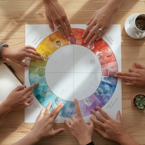
Color is one of the most powerful — and most overlooked — elements of your digital environment. The shades you see throughout your workday influence your mood, your nervous system, and your ability to stay focused. Harsh colors can create tension and overstimulation, while gentle, muted tones help your mind settle into a calmer, more grounded state.
Gentle color tools offer a simple way to shape your workspace into a soothing, supportive environment. They use soft palettes, subtle gradients, and low‑contrast visuals to reduce sensory strain and help you maintain emotional steadiness throughout the day.
This guide explores how gentle color tools work, why they’re so effective, and how to use them to support both mood and focus.
Why Color Matters in Your Workspace
Your brain processes color instantly and unconsciously. Even when you’re not paying attention, the colors around you influence your emotional state, your stress levels, and your ability to concentrate.
Harsh or overstimulating colors can lead to:
- Visual fatigue
- Increased tension
- Reduced focus
- Emotional reactivity
- A sense of internal pressure
Gentle colors, on the other hand, help your nervous system settle. They create a sense of spaciousness and calm that supports deeper focus. This aligns with the principles described in simple focus aids that reduce digital clutter, where visual simplicity plays a key role in mental clarity.
What Makes a Color “Gentle”
Gentle colors share a few key characteristics:
- Low saturation — soft, muted tones rather than bright, intense hues
- Low contrast — smooth transitions instead of sharp edges
- Warm or neutral undertones — calming rather than activating
- Soft gradients — subtle blending that reduces visual strain
- Predictable visual behavior — no flashing or rapid changes
These qualities help your eyes relax and your mind stay grounded.
The Most Effective Gentle Color Tools
Below are the categories of color tools that make the biggest impact on mood and focus.
1. Soft gradient backgrounds
Gradients with gentle transitions create a soothing visual foundation for your workspace.
- Best for: reducing visual fatigue
- Why they work: smooth color shifts calm your visual system
2. Minimalist color widgets
These include timers, breathing guides, or focus widgets that use muted palettes.
- Best for: emotional regulation
- Why they work: soft colors help your nervous system settle
3. Gentle color‑based interactions
These tools let you tap, swipe, or drag through soft color transitions.
- Best for: micro‑pauses and quick resets
- Why they work: rhythmic motion + soft color = grounding
4. Low‑contrast palettes for apps
Choosing muted themes for your apps reduces cognitive load and visual noise.
- Best for: long work sessions
- Why they work: low contrast reduces strain on your eyes
How Gentle Color Tools Support Mood
Color influences your emotional state more than you might expect. Soft colors help your mind shift into a calmer, more regulated mode.
They support mood by:
- Reducing emotional reactivity — soft tones soothe your nervous system
- Creating a sense of safety — muted palettes feel less demanding
- Supporting emotional steadiness — gentle visuals help you stay grounded
- Reducing overwhelm — low‑contrast visuals feel spacious and calm
These effects make gentle color tools especially helpful during transitions, energy dips, or stressful moments.
How Gentle Color Tools Support Focus
Focus requires a calm, regulated nervous system. Gentle color tools help create the conditions for deep work by:
- Reducing sensory strain — soft colors are easier on your eyes
- Lowering cognitive load — fewer visual demands mean more mental capacity
- Supporting smoother transitions — color‑based resets help you shift tasks
- Creating a stable visual environment — predictability supports concentration
These benefits align with the workspace strategies described in minimalist workspace tools that support calm productivity.
How to Integrate Gentle Color Tools Into Your Workspace
You don’t need to redesign your entire setup. Small changes can make a big difference.
1. Start with your background
Choose a soft gradient or muted color. Avoid bright or high‑contrast images.
2. Use color‑based widgets
Timers, breathing guides, or focus tools with gentle palettes help regulate your nervous system.
3. Choose low‑contrast themes
Switch your apps to softer, more calming color schemes.
4. Add a color‑based micro‑pause tool
Use a soft color interaction for 10–20 seconds during transitions.
5. Reduce bright accents
Replace intense colors with muted alternatives wherever possible.
When Gentle Color Tools Are Most Helpful
These tools are especially effective during:
- Morning startup
- Deep work sessions
- Transitions between tasks
- Midday energy dips
- Evening wind‑down
These are the moments when your nervous system is most sensitive to visual input.
How to Know Your Color Tools Are Working
You’ll notice:
- Less visual fatigue
- More consistent focus
- Reduced emotional friction
- A calmer, more grounded mood
- A sense of spaciousness and ease
Gentle color tools don’t just make your workspace look better — they make it feel better.
Conclusion: Color Is a Quiet but Powerful Tool
Gentle color tools offer a simple, sustainable way to support both mood and focus. By choosing soft palettes, low‑contrast visuals, and calming gradients, you create a workspace that helps your nervous system settle and your mind stay clear.
In a world filled with digital intensity, gentle color is one of the most effective tools for creating a calmer, more focused workday.